Tuesday, November 2, 2010

Music Assault Infograph

 Went with bar graphs because I liked the towers made when I organized the ipod genres.  Headphones and sound-waves in the background were a must :)  Genius title too.

Raw Data


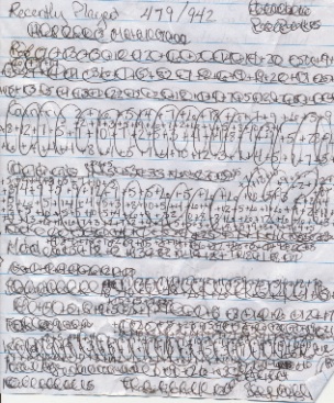
Here is some of my raw data (interpret it if you can! :) I was recording the music I listen to, the format, and how long each assaults my ears in a given day.  To figure out the genres of music I listen to on my ipod (note really messed up paper on bottom right) I totaled my recently played songs.

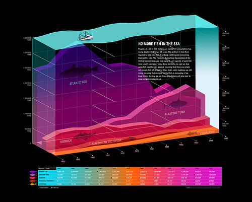
Examples of Infographics

Notes beginning Infographics project

Sunday, October 10, 2010

PSA Poster

 A lighter version.

Buy More American Made

Random family conversation turned politics and I came up with my public service announcement: "Stimulate the U.S.A., go out of your way to buy American made."  With that idea in mind, I went looking for stuff that said either "MADE IN USA" or "MADE IN CHINA."  I also thought a map would be cool and fortunately had a 1935 world atlas from a garage sale that would be perfect to scan for my poster.  I scanned a map of the United States and of China, and Prof. Babcock gave me the idea to put the map of China in the cut out of the United States map (brilliant).  So I did that, printed it out and drew it in Sharpie (to have different mediums on the poster).  I also scanned in an image of post-it notes that said "MADE IN USA" and had a flag; I then changed the USA to China (Prof. Babcock's idea) and kept the flag.  After I merged the two images I colorized it to red and put white behind the flag (so that it's half American, half Chinese flag).  Behind all of this I found a picture of Ellis Island immigrants on Google (http://prajjwal19.deviantart.com/art/Ellis-island-and-liberty-146665615?q=gallery%3Aprajjwal19%2F6499024&qo=8) which I cropped and faded.  Then my message in simple Myriad Pro: Invest in America.

Public Service Announcement Poster


These two designs are the inspiration for my poster.  Both were created by the designer John Valk.  The first one is "Dachau Revival" and the second is titled "Capturing Kabel" (I believe they are both book covers).  I found them both in the book New Vintage Type: Classic Fonts for the Digital Age by Steven Heller and Gail Anderson (ISBN 0823099598).
The linear design and the message presented in a sharp, heavyweight, all-caps text appealed to me.  Another feature I liked was the depth created by the single picture; like the text is just a blunt frame for a bigger description of his message.