Tuesday, December 7, 2010
Course Experience
In my GDI class I was able to learn how to layer in photoshop, how to use illustrator, and how to manipulate multiple pages in indesign. I liked the wacom tablet and will look forward to working more with that and making artworks graphically. My favorite project was the zine because it was sort of like an accumulation of all the project objectives plus a bonus book-binding demonstration :)
Wednesday, November 10, 2010

Monday, November 8, 2010
The Inspiration of How to Zine
My idea for a How to Zine is "How to Survive an Alternate Reality" (this way I can have fun with it).
Books I checked out from the library to use as guides:
The Boys' Book of Survival: How to Survive Anything, Anywhere by Guy Campbell
This book is my reference for ideas although mine will be more fictitious.
How to be a Zombie by Serena Valentino
This book has more outlandish ideas that will help, plus the page layout and organization of ideas will be useful.
How to Build Your Own Country by Valerie Wyatt
This book is great (seriously). Funny and educational at the same time (which I like) so the presentation, interactiveness, and again the layout and organization are what I will take from this book.
Born to be Giants: How Baby Dinosaurs Grew to Rule the World by Lita Judge
This book is less of a how to, but I got it anyway because of the text and illustration integration.
The Secret Knowledge of Grown-Ups revealed by David Wisniewski
This book isn't a how to either but it has creative ideas using "cut-out" illustrations, text/picture integration, and it's ideas are good too (funny).
A Dignity of Dragons by Jacqueline K. Ogburn
Not a how to book but I liked the illustrations, and the information on creatures at the end will be useful for my zine.
My zine will probably turn out like something of a field guide. I'd like to do the hand-drawn sketch thing plus some interactive pieces. About my idea of surviving an alternate reality: I've love fantasy books, folktales, and sci-fi movies so I thought it would be neat to combine some of the creatures and unusual circumstances I have read about into a basic survival guide (just in case someone gets sucked into a wormhole or somehow transported to another dimension and has to deal with such weird things).
Tuesday, November 2, 2010
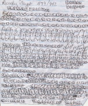
Music Assault Infograph
 Went with bar graphs because I liked the towers made when I organized the ipod genres. Headphones and sound-waves in the background were a must :) Genius title too.
Raw Data


Here is some of my raw data (interpret it if you can! :) I was recording the music I listen to, the format, and how long each assaults my ears in a given day. To figure out the genres of music I listen to on my ipod (note really messed up paper on bottom right) I totaled my recently played songs.


Sunday, October 10, 2010

Buy More American Made


Public Service Announcement Poster


 The linear design and the message presented in a sharp, heavyweight, all-caps text appealed to me. Another feature I liked was the depth created by the single picture; like the text is just a blunt frame for a bigger description of his message.
Thursday, September 23, 2010
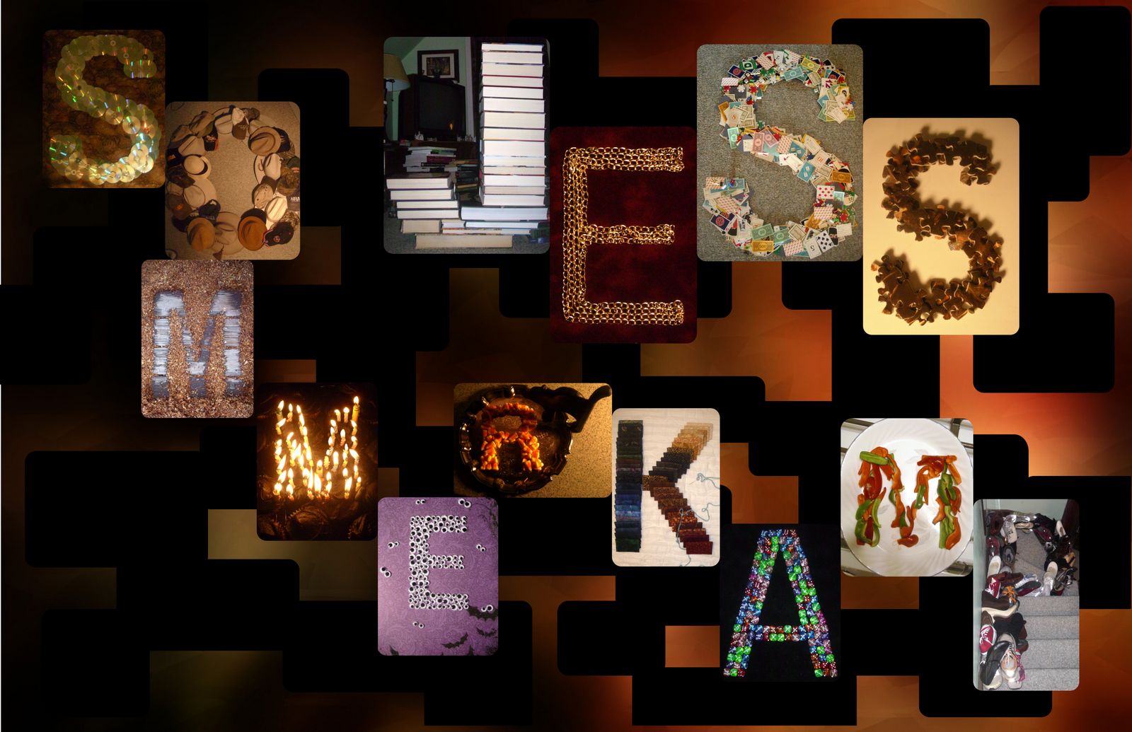
This is my poster design using the alternative representation letters. It took me a while to figure out how to arrange the letters so that you could actually read my name (and still look good). I used rounded rectangles as the clipping masks and made them all about the same height (except for my first name which I enlarged to fill up space). The background is a lot more complicated (I was having fun). The first layer of the background is actually a personal picture of a Thanksgiving table (turned sideways) with an extreme Gaussian blur; on top of that is a picture of wierd clouds which I decreased the opacity on to provide a texture, and finally, on top of that is another abstract texture that was a "happy accident" created in photoshop using the clone stamp tool on a Gaussian blurred picture of cobblestones. For the finishing touch, I connected different sizes of black, rounded rectangles to tone down the background and unite it with the letters in my name.
Alternative Representation Letters
Outline of the Plan :
Using the typeface Univers 65 Bold, print out letters to use as templates for the smaller images, or
projections to achieve the bigger images.
J- books (large image)
stack up hardback books (make sure longest and thickest are on the bottom for a strong foundation), you may need paperback books to help prop up the stem of the J --project image of J to check likeness
E- chain (small image)
using a template, arrange a chain on a non-slick surface in the shape of an E
S- puzzle pieces (small or large image)
using a template or a projection, stack up and arrange puzzle pieces in the shape of an S
S- games (large image)
combine a bunch of small pieces from games (cards, dice, poker chips, etc.) onto the floor and arrange into an S, then (you'll probably need a ladder) project the S and rearrange accordingly
S- cds (large image)
using a ladder and a projection, arrange a large selection of cds into the shape of an S (may use either side of the cds)
O- hats (large image)
collect a large variety of hats (any size, any type) and arrange in the shape of an O (use bigger hats or
more hats for the thicker sides)
M- cupcakes w/ candles (small or large image)
step 1--make delicious cupcakes, step 2--group the cupcakes together and create an outline of an M on their tops using small birthday candles (of the same height), step 3--check the accuracy of the M before lighting the candles!, step 4--make sure to have at least 2 people lighting the candles while a third snaps multiple pictures
M- pepper slices (small image)
stack and arrange slices of different colored peppers on a plate in the shape of an M (use more pepper slices for thicker sides)
E- googley eyes (small image)
use a template to arrange different sizes of googley eyes (on Halloween paper for fun), use the bigger eyes mixed with little eyes to achieve thickness
R- candy corn (small image)
arrange candy corn on a silver tray in the shape of an R, use a spotlight for dramatic lighting
K- fabric (large image)
use fat quarters (folded the same) to arrange different colors on a white quilt in the shape of a K (use a carpet needle and yarn to stick on it somewhere for fun)
A- beads (small image)
using a template, arrange beads on a non-slick surface in the shape of an A
M- sawdust (large image)
dump sawdust on a deck or plank wood, use a trowel to scrape away an M shape, pour water onto the exposed wood to better reveal the letter, adjust proportions and take a picture
P- shoes (large image)
collect a wide variety and large quantity of shoes (men's, women's, slippers, boots, heels, flats, tennis shoes, sandals, etc.), stack them up on the stairs (have one person orchestrate and another arrange) in the shape of a P (use more shoes for thicker parts)
Check out the finished products:
http://picasaweb.google.com/118189696593846715779/AlternativeRepresentationalLetters?authkey=Gv1sRgCITgzp2B7u_FtwE#
Thursday, September 16, 2010
Final Logo
Saturday, August 28, 2010
Broken Cosmos


Here are a few of my telescope drawings. The idea came from the time I took an astronomy class with a broken telescope. As you can see at first I couldn't think of a way to show a broken telescope so I put a lame bandage on it. Once again, after meeting with my professor, he suggested the moon and stars in the view of the telescope be broken to communicate perhaps not that the telescope was broken but the view of them was broken. I think this is another one of those that can be looked into too much but I like it better that my first "book" sketch! The odd telescope on the top left is a result of looking directly at my telescope and trying to make a black and white drawing of it (I know it looks a little wierd). A few drawings later and I arrived at the one on the bottom left. The plan is to make the lens with the broken cosmos a whole lot bigger and keep the bottom squished like you see here but to make it less flat.

Colorado Vacation


The Rookie Experiment


These are my very first sketches. The one on the left is supposed to show how at first I hated reading, then I really liked it. . . . When shown to others the meaning became deeper: life. The sketch on the right was an attempt to communicate that I got a guitar as a gift and I loved it. People understood that it was a gift but not that I loved it (they believed the guitar should be in a heart rather than the heart being in the guitar).
Friday, August 20, 2010


Wednesday, August 18, 2010
Subscribe to:
Posts (Atom)